WATCH THE LAUNCH VIDEO
WATCH THE PROCESS OF THE NEW IDENTITY VIDEO
Since January 2025, we have been on a journey to evolve our identity and modernise our Football Club's crest and wider brand identity.
We needed to do this to:
- Move towards a mobile-first ethos – The Club embraces a digital-first ethos for our identity. Our current crest, designed almost 20 years ago, is outdated for today’s digital media and technology. We need a more practical and functional identity.
- Attract new audiences – Our identity should appeal to all audiences, attracting both current supporters and new demographics. We aim to inspire the next generation of local football fans with a modern brand that reflects today’s experiences and technologies.
- Align with Club goals and ethos – Under our new CEO, the Club has embraced a modern, inclusive vision that reflects our identity as a progressive and dynamic football club.
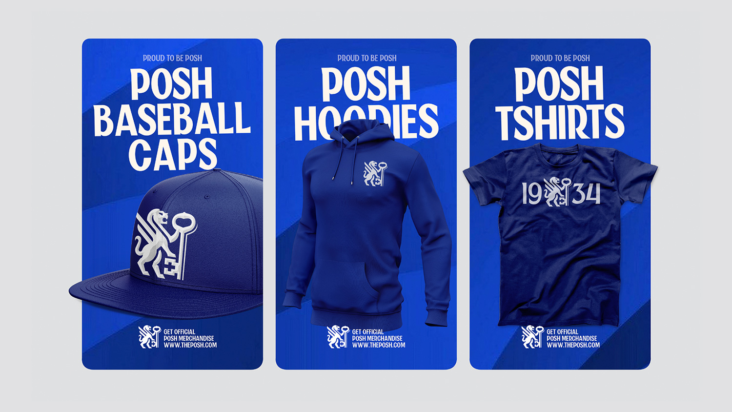
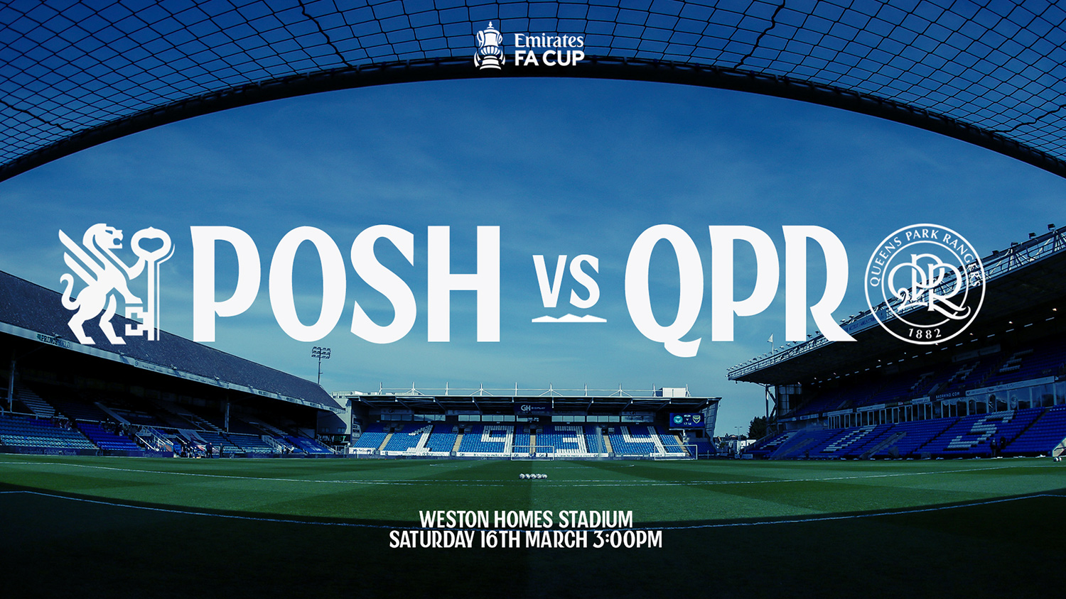
- Provide more ways to represent us - We're expanding our Posh Store to offer more merchandise and leisurewear for Peterborough United fans, enhancing both kits and casual apparel.
The Club's owners and leadership team view this as a significant step forward in the Football Club's progression while acknowledging the importance of history, heritage, and storytelling in shaping its identity.
Owner and Chairman Darragh MacAnthony said, “We have to evolve, and branding is a massive part of that. I look at the big clubs and see how they are evolving, we have to modernise and we have to move with the times.”
Working with football club identity designer Christopher Payne, we conducted a thorough and transparent process, gathering the thoughts and views of our supporters through fan surveys, as well as hosting fan forums and focus groups.
Payne spent time in Peterborough, speaking with Club leadership, City historians, and fans and attending Posh games, home and away.
Payne said: “It was important to live life like a fan, to absorb all things Peterborough, to speak with fans, and to see and experience everything. I wanted to learn everything about the rich history of the Club, as well as understand its future ambitions. It’s a big project, and it’s important to understand everything.”![]()
Fan surveys and conversations
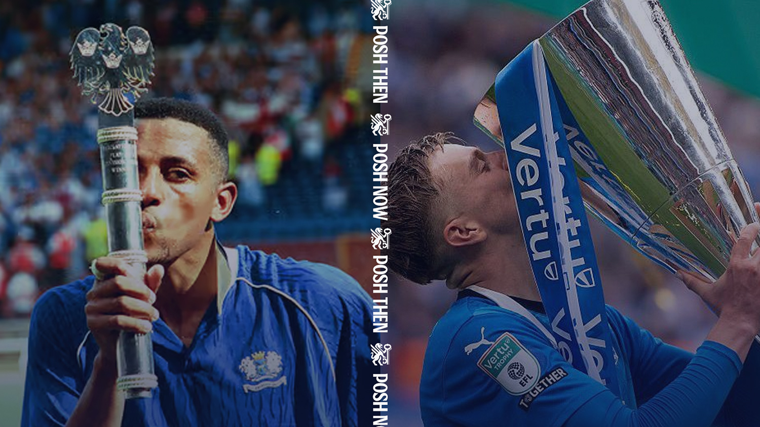
Our surveys revealed that the most popular elements of the current crest were the winged lions, the keys, and the motto 'Upon This Rock.'
Fans told us that the winged lions represent strength, power, protection, and aggression, all elements that we want to see on the pitch.
Fans also told us about the importance of the keys as symbols for Peterborough. Keys are seen in and around Peterborough, from old historic buildings and old City maps to the City’s coat of arms and the Football Club’s current club crest. Keys are an undoubted symbol of Peterborough.
Design process
Over the spring, Payne worked closely with the club leadership team, exploring various designs, themes, and ideas for the new club crest and how it could reflect the values of being a modern and forward-thinking Football Club at the heart of the community.
It was essential to create a design that evolved from our current badge and aligned with the feedback we received from supporters, both in person and through the supporter surveys.![]()
Approval from the Chairman
In late April 2025, we shared a recommended design with our Chairman, Darragh MacAnthony who was impressed by what he saw;
Darragh MacAnthony said: “I was sceptical about the whole project at first, but having seen the journey that we have been on, and how we have involved supporters, it just makes sense. We are evolving in our commercial department, we are evolving on the pitch and in the boardroom, and so our brand has to evolve. When I first saw it, it blew me away. I love it! I am really excited by it all.
Focus groups with fans
Shortly after the chairman’s approval to proceed, we conducted many fan focus groups, inviting all interested supporters to view the new identity and share their thoughts and feedback on the new look for Peterborough United. The reaction was overwhelmingly positive, with almost all participants expressing their excitement, enthusiasm, and approval for the Football Club's new identity.
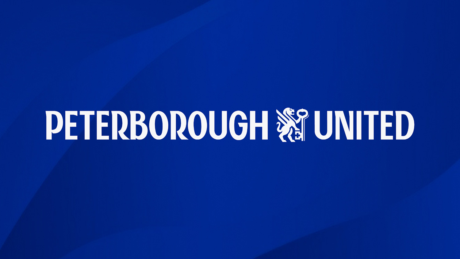
Our new identity
We are pleased to announce our new identity that will be used from June 2026 onwards. The feedback from all supporters and key stakeholders indicated that this identity rightly represents Peterborough United. The design is modern, powerful, and relevant to our Football Club’s history and future.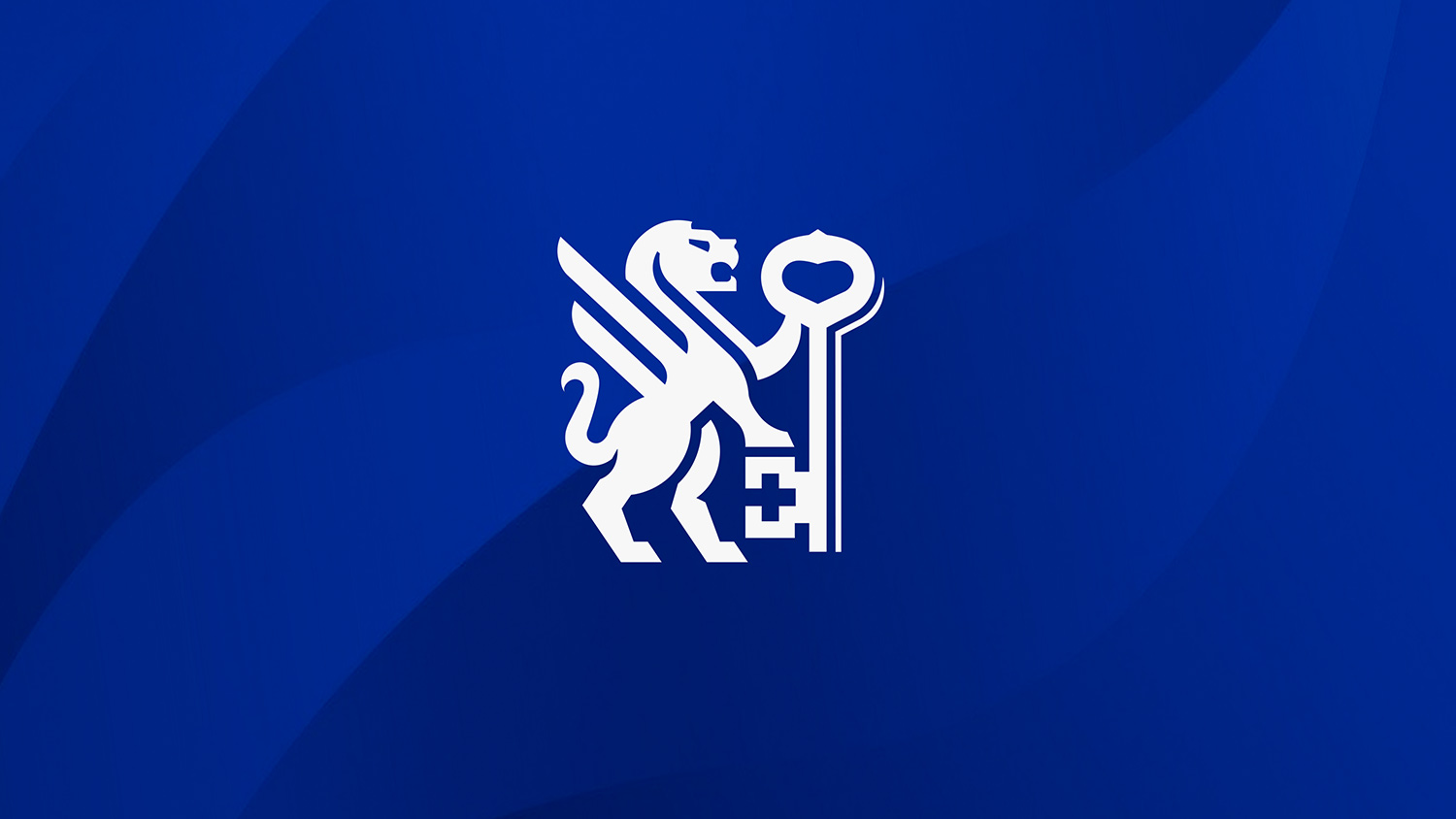
![]()
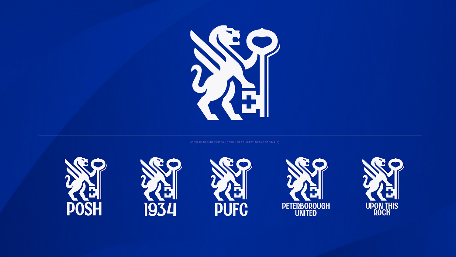
Features of the design:
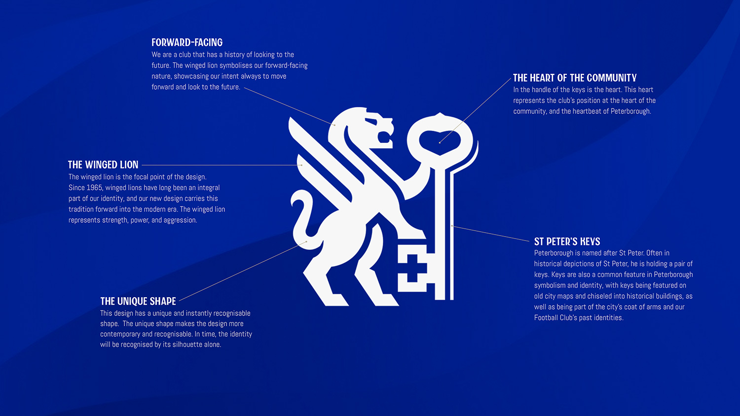
The winged lion
The winged lions featured on our current badge are reimagined, with a single-winged lion depicted facing forward and holding the City’s keys aloft.
The keys of Peterborough
The keys of Peterborough remain; they are featured on the City’s coat of arms and in our current identity. They can be seen prominently in and around Peterborough and are displayed on our Football Club's new identity, held aloft by the winged lion.
The heart of the community
Fans told us that the Club is the heartbeat of Peterborough. This aligns with the CEO's vision of being a club in the heart of the community. This sentiment and ambition are reflected in the handle of the key, where you will find the heart.
Additionally, one of the Football Club's first mottos was 'Cor Unum,' which was displayed on the crest. 'Cor Unum' is a Latin phrase that translates to 'One Heart.'
Chief Executive Dawn Gore said: “The football industry is evolving and from the training ground to the boardroom, we are raising standards and continuing to strive for excellence in all that we do.
"The brand redesign is one part of our growth plan. It has never been about changing who we are, it’s about updating our identity and future proofing.
"From the outset we wanted to listen to fans and overwhelmingly, they wanted to honour our history. With Chris Payne’s passion, creativity, expertise and unwavering commitment in guiding us through the process, I am delighted we have captured the past and also built for the future.”
Custom design typography
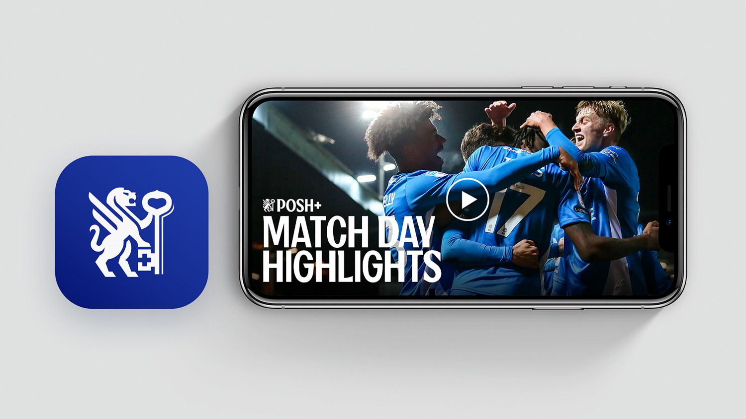
In addition to the Football Club releasing its new look identity, we are also introducing our new custom-designed typeface - Posh Type.
Posh Type, also designed by Christopher Payne, will be used across all club identities and communications. The Posh type has the style and elegance that our nickname suggests; it will help the Club develop a clean and consistent design style to raise our profile nationally and internationally.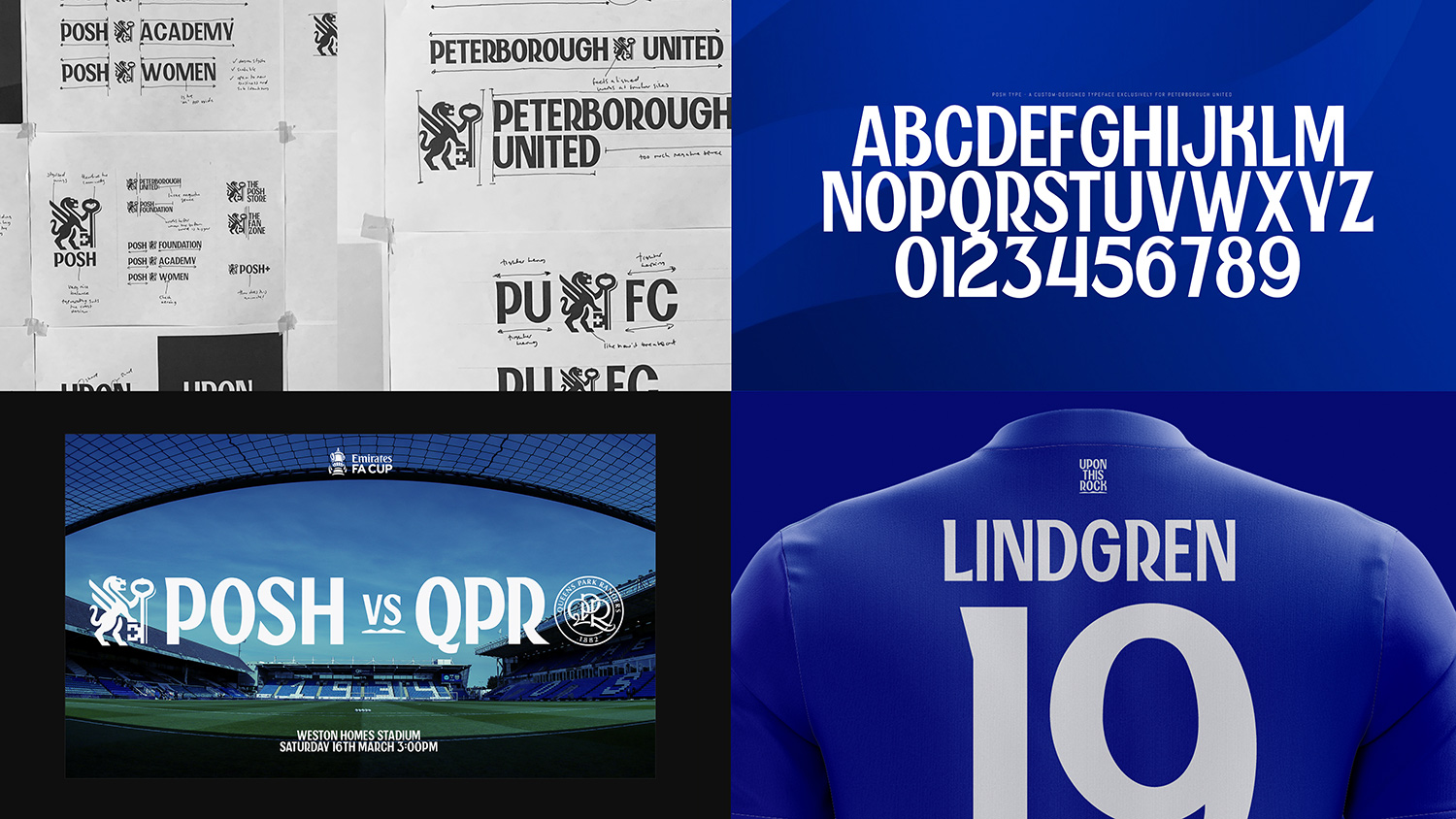
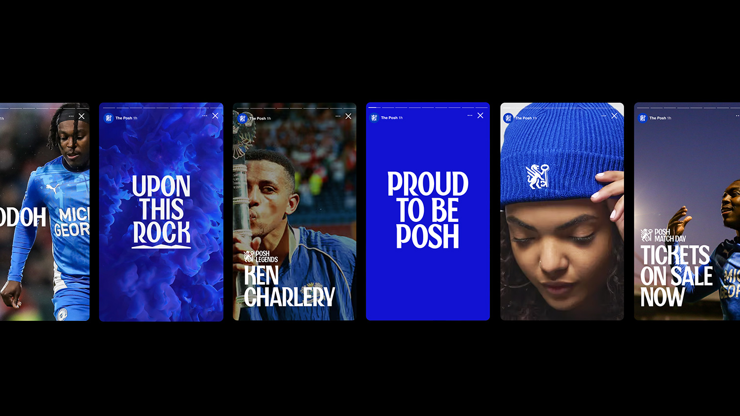
Sub-identities
Finally, as part of this process, we are also introducing a series of sub-identities that will help tell our unique story more deeply and offer the supporters more ways to represent the Football Club.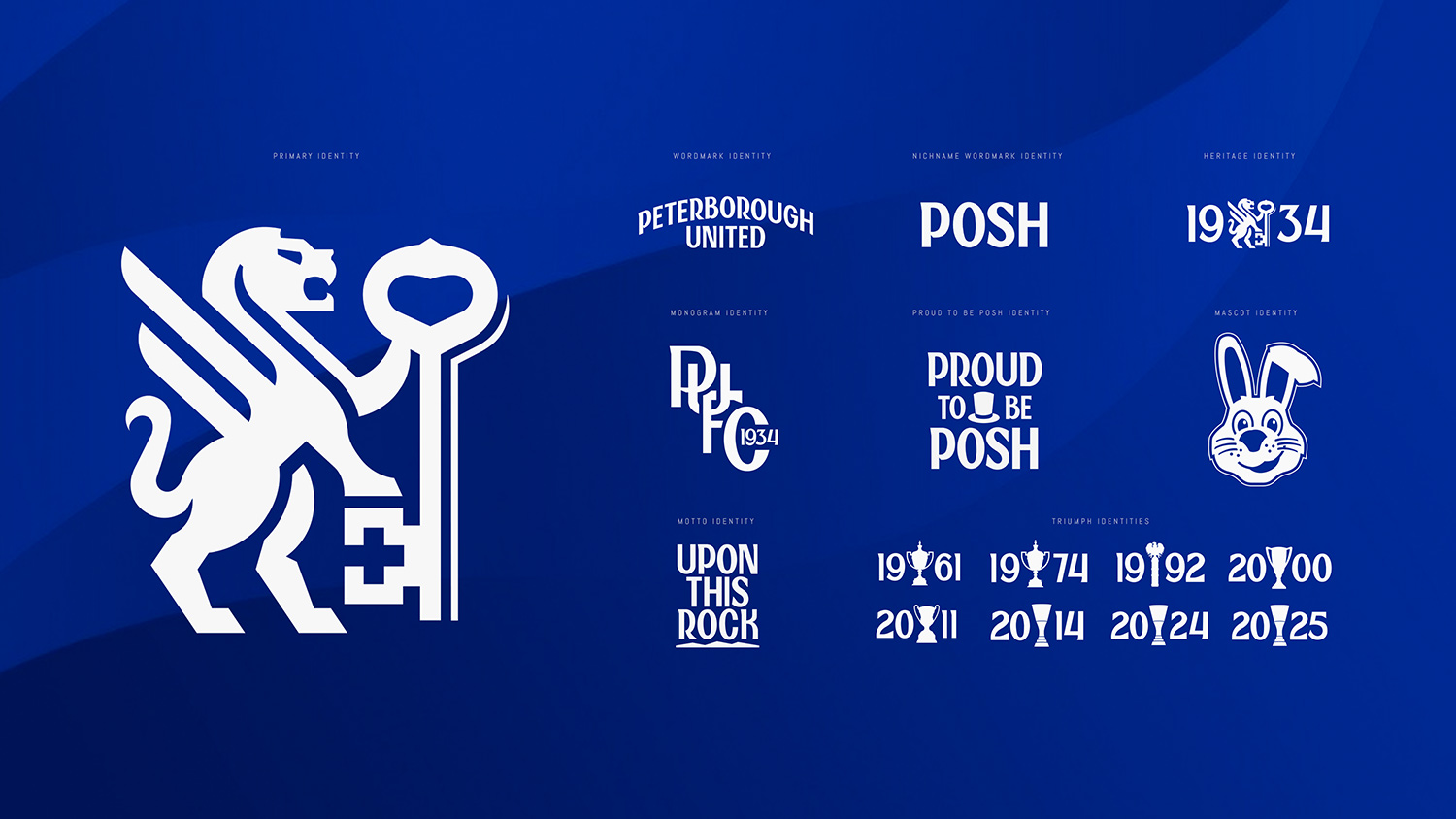
Our initial suite of sub-identities includes:
- Our wordmark identity
- Our motto identity
- Our proud to be Posh identity
- Our heritage identity
- Our triumph identities
- Our mascot identity
Our new identity, typography, and sub-identities will be used from June 2026 onwards.
Thank you to all the supporters who took part in this process.
We would like to thank all supporters who have participated in this project and offered their valuable opinions via the two fan surveys we released, the fan forum, and focus groups.
We know that this new identity will enable the Football Club to thrive for many years to come.
Visit the New Posh Identity website to find out more.